
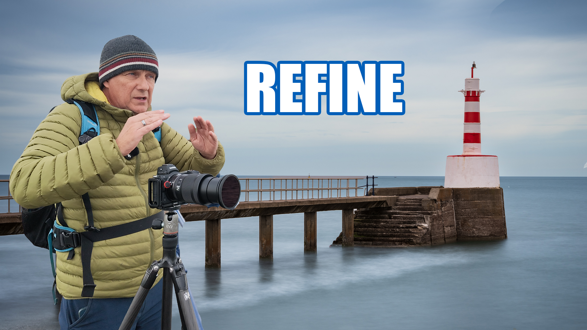
Amble may not be the prettiest location on the Northumberland coast, but that is part of its photographic appeal. The harbour has working piers, sea defences, boats, stonework and a small lighthouse extending into the North Sea. It feels more industrial and weathered than many nearby coastal locations—and that makes it particularly well suited to long-exposure photography.
I arrived while the tide was high, planning to create a series of simple black-and-white photographs. My original idea was straightforward: use a strong neutral-density filter to smooth the water and allow the solid structure of the harbour wall and lighthouse to stand against it.
What followed became something slightly different. Rather than finding the composition immediately, I made a series of images from subtly different positions. Each attempt taught me something about the scene, until moving the tripod only a few metres finally gave the lighthouse and pier the separation they needed.
It turned into an unplanned lesson in one of the most important parts of landscape photography: working the scene.
Why Amble Harbour suits long exposures
Long-exposure photography often works best when a composition contains a contrast between fixed structures and moving elements. At Amble Harbour, the pier, lighthouse and sea defences remain sharply defined while the movement of the water can be softened into something calmer and more minimal.
The high tide was particularly helpful. There was plenty of water surrounding the harbour structures, giving it space to move during exposures of 20 to 30 seconds. That movement simplified the surface and helped separate the darker stonework from its surroundings.
The overcast coastal light also suited a restrained treatment. I initially imagined the finished photographs in black and white, with texture in the pier and sky balanced by smooth water and generous negative space.
Keeping the first composition simple
My first composition included the lighthouse at the end of the pier, part of the harbour wall and plenty of open water. It was deliberately uncomplicated because simple arrangements usually work well for this type of photography.
Before making the exposure, I removed the camera strap. It is a small detail, but a loose strap can flap in the wind and introduce vibration during a long exposure. Even a stable tripod cannot compensate if something attached to the camera is being repeatedly caught by strong gusts.
I fitted a Kase 10-stop neutral-density filter using an adaptor for the lens, selected ISO 64 and f/18, and calculated an exposure of roughly 20 seconds. I also used a five-second self-timer so that pressing the shutter would not cause movement at the beginning of the exposure.
The resulting photograph was perfectly acceptable, but something did not feel right. I was looking almost squarely at the scene, which made the lighthouse, pier and background appear compressed into a flat, two-dimensional arrangement.
That first frame was not a failure. It gave me a reference against which every later composition could be judged.
Moving the tripod—not merely turning the zoom ring
My next instinct was to change position and introduce more depth. By moving farther around the harbour, I hoped to improve the separation between the lighthouse and the post behind it while making the pier appear more three-dimensional.
The second exposure was around 30 seconds at f/18 and ISO 64. I framed it with a square crop in mind, but the new angle still did not create enough separation. The foreground harbour wall added another layer, yet it complicated the image without contributing much to the final composition.
This is the point at which it can be tempting to settle for the photograph already made. Technically, it worked. The water was smooth, the exposure was controlled and the lighthouse was clearly visible. But a technically successful image is not necessarily a compelling one.
I continued to move.
That physical movement is important. Working a scene does not simply mean standing in one place and changing focal length. A zoom lens alters how much of the scene is included, but it does not change the relationship between foreground, subject and background. Moving the camera does.
Testing the square composition
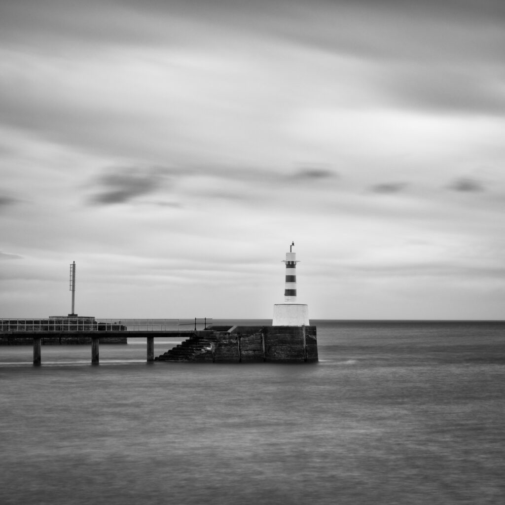
I found a tighter view across the harbour entrance and returned to the idea of a square crop. The intention was to concentrate on the lighthouse at the end of the wall and reduce the scene to its most essential elements.
This time I paid particular attention to the position of a second mast, attempting to place it cleanly between two of the pier supports. Small alignments like this can make a surprising difference. When vertical elements overlap awkwardly, the viewer may not consciously recognise the problem, but the photograph can still feel untidy.
I made another 20-second exposure at f/18. The result was stronger, but the lighthouse remained too small and still merged with the structure behind it. I had simplified the edges of the frame, but I had not yet solved the underlying spatial problem.
The only answer was to keep changing my viewpoint.
Finding depth and separation
As I moved farther along, the composition began to open up. Switching from the square crop to the camera’s full sensor ratio gave the pier more room to extend through the frame and created useful negative space around the lighthouse.
The image was improving, but I still wanted the lighthouse to appear as though it stood farther out in the water. To create that illusion, I needed to lose the harbour wall directly behind it.
Eventually, I reached an angle where the background structure disappeared. The photograph became much simpler: the pier projected into the sea, the lighthouse sat clearly at its end and the surrounding water gave the subject room to breathe.
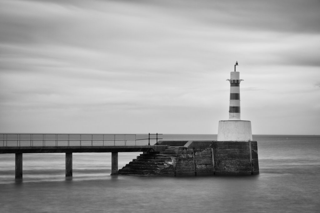
This was the first frame that felt close to what I had imagined.
I then moved about five metres to my left and made a slightly wider version. It sounds like a minor adjustment, but it created a noticeably different image. More of the pier was visible, strengthening its role as a leading line and giving a better sense of it stretching out towards the lighthouse and open sea.
The difference between the early frames and these later photographs did not come from new equipment, a different filter or a dramatic change in the weather. It came from moving the tripod and paying attention to how the elements related to one another.
Processing the black-and-white photographs
I processed the earlier versions quickly because I did not believe they were the strongest images from the session. There is little value in spending half an hour perfecting a photograph that is unlikely to survive the final selection.
For the black-and-white conversions, I used a combination of Adobe Lightroom and Nik Silver Efex. Lightroom allowed me to remove sensor-dust marks, make local adjustments and control the sky efficiently. Silver Efex provided a useful starting point for the monochrome contrast and structure.
My broad workflow included:
- Removing visible dust spots.
- Darkening the sky with a selective mask.
- Converting the image to black and white.
- Adjusting structure and film-style tonality.
- Returning to Lightroom for local contrast and brightness changes.
- Lifting the whites in the lighthouse while retaining detail.
- Adding a restrained post-crop vignette to guide the eye.
The key was to preserve separation around the white lighthouse. Heavy sky adjustments can create dark halos or spill across the structure, so I refined the masks and used an inverted radial adjustment where necessary rather than forcing a single broad gradient to do everything.
Why the final photograph remained in colour
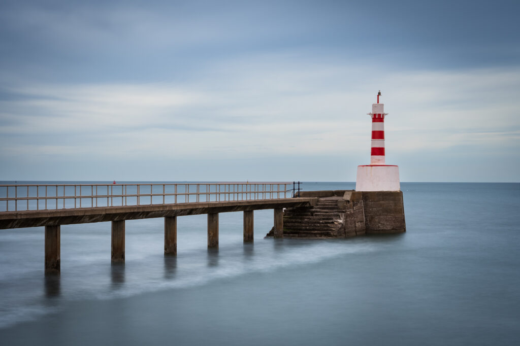
Although I had approached the entire session with black and white in mind, the final, wider composition suggested a different treatment as soon as it appeared on the camera screen.
The scene contained gentle cool tones in the sky and water, while the stone pier carried a warmer colour. Rather than remove that relationship, I decided to process the photograph in colour using Lightroom alone.
I began with the Adobe Landscape profile and set the white balance to daylight. I then reduced the brightness of the sky, lifted detail in the pier and lighthouse, and corrected the excessive warmth in parts of the stonework with selective masks.
The edit was intentionally subtle. The photograph did not require an artificial storm or dramatic contrast. Its strength came from the open space, the quiet colour palette and the simple progression of the pier towards the lighthouse.
Going to a location with a preconceived visual treatment can help provide direction, but it should never prevent you from responding to the photograph in front of you. The best image from a black-and-white shoot may still be the colour one.
What working the scene actually means
“Work the scene” is common photographic advice, but it can sound vague until you see how the process unfolds. On this occasion, it involved making several versions that were adequate but not quite right, identifying why they felt flat and gradually changing the viewpoint until those problems disappeared.
The process was not random. Each new photograph answered a question raised by the previous one:
- Is the square crop helping or restricting the composition?
- Does the foreground wall add depth or merely create clutter?
- Is the lighthouse clearly separated from the background?
- Does the pier feel as though it projects into the sea?
- Would a tighter frame simplify the image?
- Does a wider frame give the subject more space to breathe?
Working a scene is therefore less about taking dozens of nearly identical photographs and more about refining a visual idea. Make a frame, assess it, identify the weakness and change one thing that may improve it.
Practical lessons from Amble Harbour
The session reinforced several useful principles for long-exposure and landscape photography:
Secure the camera before a long exposure
Remove or restrain loose straps, use a sturdy tripod and introduce a shutter delay. Strong coastal wind can ruin an otherwise sharp exposure.
Begin with the simplest version
A clean initial composition makes it easier to understand the subject. Additional foregrounds and overlapping structures should earn their place in the frame.
Look for separation
Check the relationship between the main subject and everything behind it. Moving sideways can often solve an overlap that no amount of cropping will fix.
Use your feet as well as your lens
Changing focal length affects framing; changing position affects perspective. They are not interchangeable.
Treat crop ratios as compositional tools
Square and standard aspect ratios create different balances. Try both, but choose the one that serves the structure of the picture rather than using a crop out of habit.
Do not over-process weaker frames
A quick edit is enough to establish whether an image has potential. Save the detailed work for the photograph that genuinely deserves it.
Stay open to a different final treatment
It is fine to arrive expecting black and white and leave with a colour image. The photograph should determine the processing, not the original plan.
The best position is rarely where you first place the tripod
The most useful lesson from Amble Harbour was also the simplest: do not assume that the first place you stop is where the best photograph will be made.
Start wide, move closer, step left and right, try a different height and pay close attention to overlaps. By “move closer”, I do not merely mean zooming in. Physically change your position and watch how the relationship between the elements changes.
It took several compositions before the pier, lighthouse, sea and negative space came together. Some of the earlier images were reasonable, but the final frames were stronger because each attempt helped me understand the location a little better.
Long-exposure photography can appear slow and methodical, but that does not mean the camera should remain rooted to one spot. Sometimes the most productive thing you can do is pick up the tripod, move five metres and begin again.



Leave a Reply